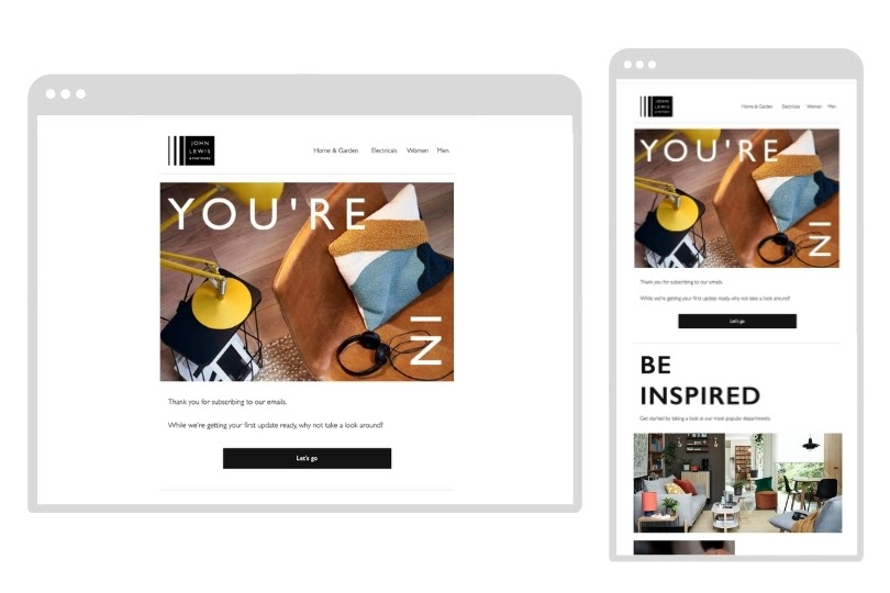
responsive and mobile friendly web designs, what is the difference?
Think about all those times, to find simple answers and solutions in everyday life, you take the phone out of your pocket. Yes, it is enough “sometimes” to search on mobile for anything and everything in life. As your smartphone continues to become more powerful, you will need to understand its implications on your browsing experience. Now we what responsive and mobile friendly web designs, what is the difference? We will seek to answer this question.
How will the internet and websites evolve from mobile devices? Yes, since most users open and access the web on their mobile devices, web design needs to match their standards and constraints.
There are two design principles to make a website user-friendly, respectively,
- mobile-friendly and
- responsive design.
As designing a website for a simple mobile user experience has become a priority, these design methods attempt to fulfill that need in two different ways.
Let’s explain their differences and how the former work better than the latter.
responsive and mobile friendly web designs
When you start designing a website, you’ll want to know the difference between mobile-friendly, responsive vs. especially for mobile. So what do they mean and which one do you choose?
Even these terms that are commonly used by web designers and web developers can be misunderstood.
This is because they are being misused. Many people, and even many experienced web designers, will use these terms to refer to websites that work and look good on a smartphone or tablet.
As most users spend time on any type of screen, many websites are making a concerted effort to adapt to different screen sizes. Any website that doesn’t do this can fall far behind its competitors.
Three hands are connected but each hand uses a different screen size
But don’t worry, in this article, we’ll go over the most mobile-friendly, mobile-friendly, and responsive methods, give some key principles to keep in mind.
All of these things will help you make a solid and informed decision for your website.
The difference in view
If you’re new to web design, you probably have a lot of questions about how to design a website to be attractive on desktop and mobile devices.
But from desktop to mobile, there are many things your website can look like.
Domain page for web and mobile
Mobile friendly, mobile optimized and responsive is a web design approach that aims to make websites usable and viewable on a variety of devices.
For a quick reference guide, here are the terms in brief:
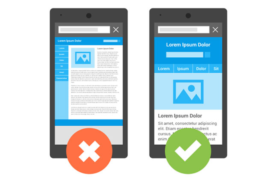
Mobile friendly design involves converting a website designed specifically for desktop screens into a smaller version for smartphones or tablets.
This is usually the minimum of mobile design that most companies can get away with.
Although it may seem like a simple and cheap solution, many websites are successful if they follow user-friendly design tips.
Mobile phone conversion, although it sounds basic, is actually a much higher and more complicated process than mobile reception.
A mobile-optimized website isn’t just a smaller version of a desktop site, or it’s as simple as resizing an image for a smaller screen.
This is a website designed entirely for mobile use.
Responsive websites are able to respond to the device being viewed and will automatically adjust themselves to work efficiently and effectively on laptops, tablets, smartphones and almost anything else.
if any other device.
- This is the most responsive web design.
- web design for desktop and mobile
Whether you opt for mobile-friendly, mobile-optimized or responsive web design, your website can always be great as long as you know what to look for
Lucky for you, we’ve got an in-depth look at web design that’s mobile-friendly, mobile-friendly, or responsive, and how to do it right.
What is Mobile-friendly Design?
Mobile responsive web design is a set of principles that shape the appearance of websites for mobile users while maintaining the same layout and appearance on all devices, regardless of size of the screen and part of the device.
According to this design, the website will look the same on the desktop and mobile, except the appearance of the phone will be smaller.
What is the Mobile friendly Web Site?
A mobile web design is a website that is primarily designed with mobile users in mind. This means starting with the smallest screens, such as smartphones, and expanding to large screens such as desktop computers.
This is a different approach to user-friendly web design, where the goal is to take a large form and condense it into a smaller size. mobile site design
When people come to your website on their phones, you want users to be able to quickly find what they need, whether it’s finding a product or finding an answer.
In addition to this, the best mobile websites require simplifying the website by compressing images, reducing duplicates and limiting the text area.
They avoid drama, effects-over effects, and pop-ups.
Here are some basic principles of mobile-friendly web design:
- Sorting using columns is simple
- Little need to type
- Graphics that use a lot of white space
- Movement is easy
- A few general tips to reduce downtime
You would think that since the mobile version of the website is smaller than the desktop version, it would be easier to create.
But in reality, the opposite happens. Consolidating your product or service into a simple, easy-to-use design can be difficult. mobile best web
Newen’s approach to this website is to make it simple.
The first page itself is straight to the point with minimal text.
Any mode in which this website is viewed will not affect its design or functionality.
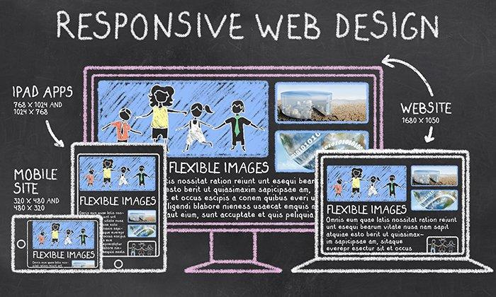
What is a Responsive Design?
Responsive website design refers to design principles that help in providing an easy user experience on all devices. Responsive design makes the website well-suited for the required functionality and user experience characteristics of various devices including desktops and smartphones.
In-demand app developers who are tasked with creating a wide variety of user-friendly apps are the ones who benefit the most from responsive design principles.
What is a Responsive Website?
Responsive design is a website design that will adapt and adapt to multiple screen sizes.
You will be able to adjust the width of the browser from the widest to the narrowest to ensure that the website adapts to different sizes of web design for desktop, laptop, tablet and smartphone screens
Responsive design is able to adapt to different devices and situations, from smartphones to 4K screen monitors.
This is what responsive design is all about. Because of its flexibility and responsive nature, this process for web design is often complicated and expensive.
- A fully responsive website will look different, feel different and have a different user experience on different devices.
- Websites on desktop will boast a different user experience than websites on mobile devices
- The screen layout of the website differs depending on the device it is opened on
- Website designs are optimized to be user-friendly and focus on improving usability.
If you are thinking about responsive web design,
here are some responsive design basic features:
- Multiple stops for web design – this means creating a layout for every place your website layout will change. This defines how responsive your website will be and where things will continue at any break.
- Liquidity – as the screen gets smaller and responsive, the text will take up vertical space and everything else will shrink. This means designing for fluidity and movement ensuring that anything can be moved to a new location without compromising its quality.
- No desktop or mobile first: It doesn’t matter if your users are primarily desktop or mobile, the responsive design will fit on any screen. Therefore, making sure that the functionality and design work on the big screen is just as important as it is on the small screen.
- Responsive web design is technically savvy
- In the technology-wise plan, you can see how all three models handle the same design and layout.
Responsive design is all about how and where things move on any screen size.
What is Responsive Mobile Web Development?
In practice, designing user-friendly web pages can be tricky, especially if the website is already in desktop form, but there are tips for user-friendly web design that can help.
Often, reducing and adapting information from a desktop version to a mobile version is a business process:
- what key information should readers see?
- What information can you gather in the carousel?
key features of mobile friendly design
A user-friendly website is available, sensitive to the user experience on all devices, except for adjusting the screen size.
The user experience and core design remains unchanged across all devices
Mobile friendly design focuses on scaling the design to fit the screen
Some desktop-friendly keys, such as the drop-down menu, don’t work well on mobile devices
A user-friendly web design is usually a stripped-down desktop version.
It is an approach to web design that makes small changes to a desktop website so that it can be used on smartphones.
Implementing this process means that web designers need to keep a few important principles in mind:
- All text used on your site should be at least 14pt or 16pt.
- It’s fairly standard on a laptop screen, but anything smaller is difficult to read and understand.
Images should be resized to be small enough to load quickly on a smartphone, via a mobile internet connection. - Some effects, especially mouse effects common on desktop sites, cannot be used with smartphones and should be avoided.
The elements on the page should be carefully designed and arranged so that they do not collapse when the page is reduced to the size of the phone.
Instead, items can be stacked on top of each other using a side-scrolling carousel, such as proofs or images.These are the main characteristics of responsive design
Which plan is right for you?
From the above description of the main features, it is clear that responsive web design has clear advantages over mobile responsive web design.
From an improved user experience to the area of search engine optimization, responsive design is more user-friendly for many purposes.
benefits of responsive design
Device switching
The most important part of responsive design is the ability to adapt to different screen sizes. This change does not mean that it increases or decreases the perception of the website as a screen, but comes with a configuration according to the size of the screen so that users have a smooth experience when interacting with features and services. .
Just because you’re accessing the website on a small screen device, you don’t need to zoom in to see the larger content.
Smooth user experience
With wide adaptability across different screen sizes and device dimensions, users can use multiple phones to access your website and have the same user experience and smooth interactions despite differences in screen sizes and device performance.
needs a few corrections
When you design your website with responsive design principles, you only have to maintain one website instead of maintaining two websites for mobile users and desktop users.
This saves you money in terms of maintenance effort and cost.
Since the design is good and works on all devices and you don’t need to manage different security, site maintenance is easy.
Although the initial development cost of a responsive website may be a little more, it eventually pays off with less maintenance.
From a SEO perspective, which is better?
Google, as a leading search engine, has always been clear about the importance of a high-quality website with a better mobile user experience in search engine rankings.
Google’s search engine algorithms are also adjusted to support a better user experience.
Since mobile users make up the majority of website traffic in all niches, Google already accepts mobile-first listings.
This is why responsive websites always have better search engine exposure than websites that only follow desktop design or mobile friendly design.
Which is better: user-friendly, the best phone, or responsive? –
At this point, you may be wondering where all of this is leading you, but you may want a clear answer to a simple question: which of these systems is the best?
Should my web design be user-friendly, responsive or optimized?
Well, unfortunately, that’s a question that doesn’t have an easy answer.
Or rather, the answer is that it depends on your needs, your business and, frankly, your budget.
Now that you know what mobile-friendly, mobile-optimized, and responsive design has to offer, you can design the one that will be best for your needs.
No matter what you decide, there are solutions to make your website look good and work well, even if you need a professional developer to help you.
Want to make sure your website is responsive in terms of user experience on all devices?
Well, you can quickly check the productivity of your website with the help of a simple test tool.
You can install Google Analytics and add your website to Google Search Console.
You can track simple traffic patterns and various metrics of visitors and your search engine details using this app. This is an easy way to review and evaluate how responsive your web design works on different devices.
Closing remarks
As mobile users continue to dominate the web user experience and search engine algorithm settings, designing your website for mobile users is no longer just an option but a necessity.
Responsive and mobile friendly web designs are helpful and appear to be tailor made to suit your needs.
You can also consider mobile friendly web designs built from responsive web thinking
Web design fully accommodates this need.
You may also like

How To Increase Public Watch Hours On YouTube
This article is about how to Increase Public Watch Hours On YouTube. Content creators are always loo
6 steps on how to reset gmail password easily
So you’ve found that your Gmail password isn’t working. In the panic that follows, you m

How to Fix Windows 7 User Login Failed
This article is about how to Fix Windows 7 User Login Failed. It happens to some people that the use